Markers
Let’s create the StaticMap object:
import oneworld as ow
mymap = ow.StaticMap(view = [-125, -66.5, 21, 50],
                     central_longitude = -98.6,
                     projection = 'AlbersEqualArea',
                     inner_borders = ['USA'])
We can represent point data in a map using markers. Once the map has been created, we can add markers to it:
mymap.add_markers(latitude = [36.122288, 40.007984, 32.232845],
                  longitude = [-97.069263, -105.265457, -110.950172])
Which renders the following map:

Color and size for all markers can be specified as a single value common for all the markers, or by using a list where each element corresponds to one marker:
mymap.add_markers(latitude = [40.28, 36.12, 40.01, 32.23, 44.97],
                  longitude = [-118.44, -97.07, -105.26, -110.95, -93.23],
                  color = ['Pac', 'Central', 'Central', 'West', 'East'],
                  size = [2.1, 2.3, 1.8, 1.0, 1.6])
Note that color accepts both categorical and numeric data. The resulting map is thus:

If the information is contained in a pandas Dataframe, we only need to specify the names of the columkns containing the information to obtain the map:
import pandas as pd
data_dict =  {'lat' : [40.28, 36.12, 40.01, 32.23, 44.97],
              'lon' : [[-118.44, -97.07, -105.26, -110.95, -93.23],
              'reg' : ['Pac', 'Central', 'Central', 'West', 'East'],
              'pop' : [2.1, 2.3, 1.8, 1.0, 1.6]}
df = pd.DataFrame.from_dict(data_dict)

mymap.add_markers(latitude = 'lat', longitude = 'lon', color = 'reg',
                  size = 'pop', data = df)
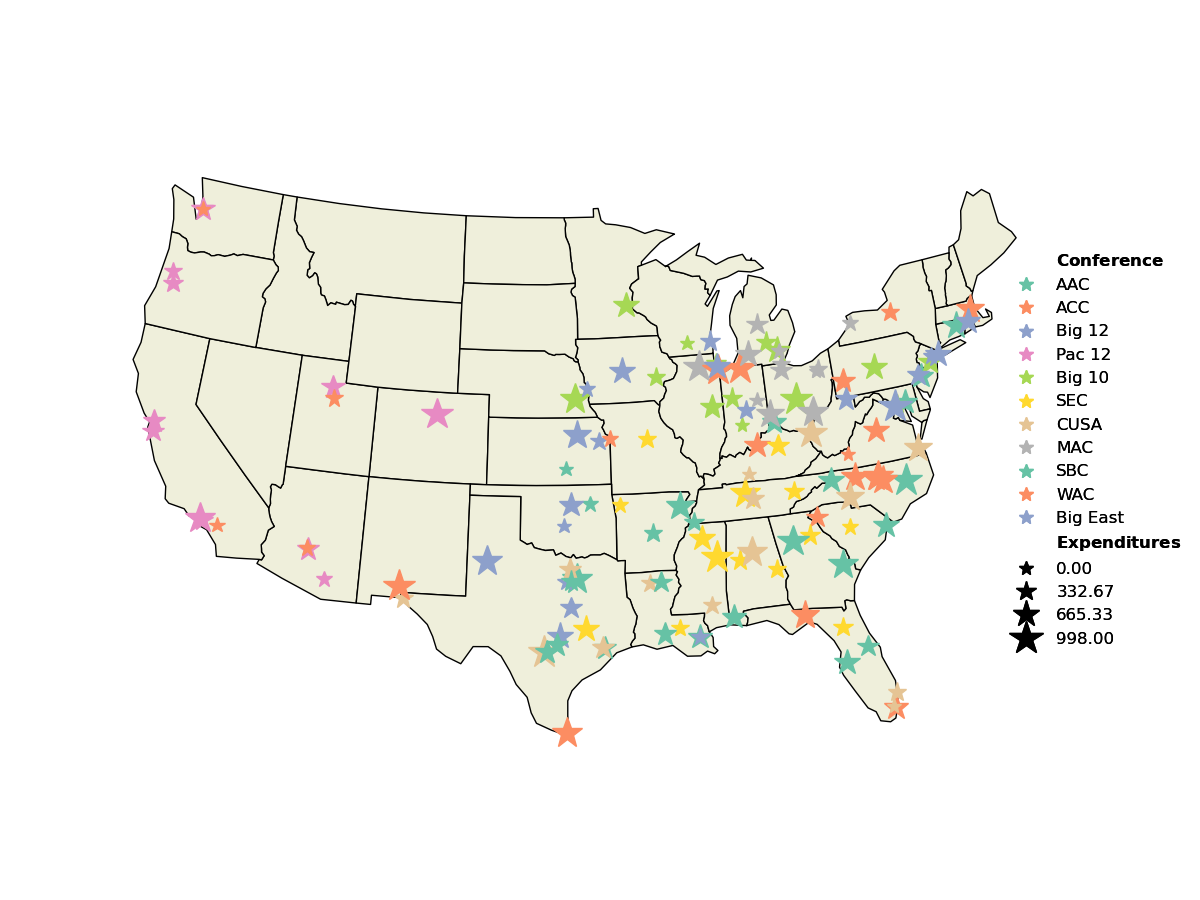
With which we obtain the same map as before. We can customize the color palette, the range of sizes to use, marker shape, legend placement, … Here is a more complex example:
df = ow.load_dataset('conferences')

mymap.add_markers(latitude = 'Lat', longitude = 'Long', data = df,
                  color = 'Conference', palette = 'Set2', n_colors = 6,
                  size = 'Expenditures', sizes = (10, 25),
                  marker = '*', legend_pos = 'center right')
Where we used a preloaded dataset, to obtain the following map:
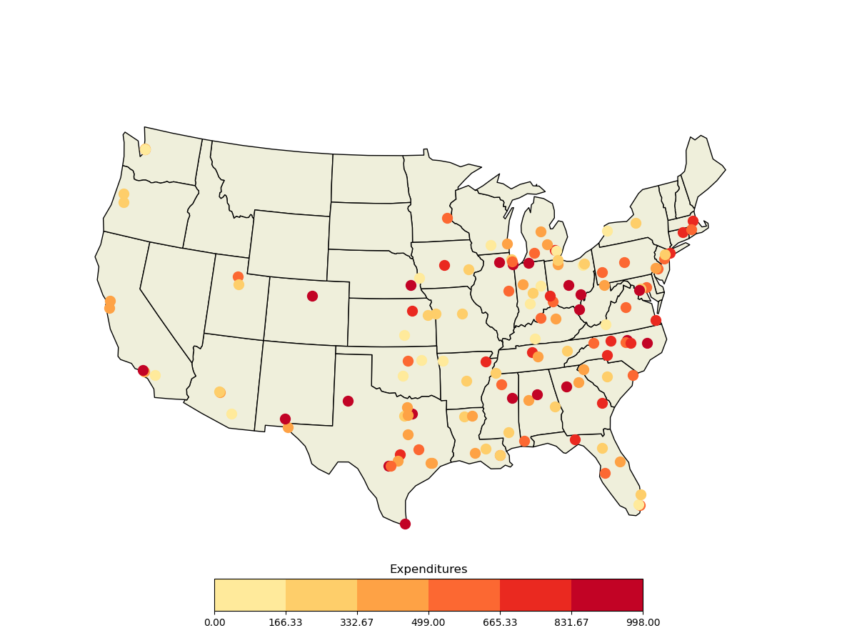
If instead of a legend we want to use a colorbar, we can tell the method not to add a legend and manually add later the colorbar, which will use the last data input:
df = ow.load_dataset('conferences')

mymap.add_markers(latitude = 'Lat', longitude = 'Long', data = df,
                  color = 'Expenditures', palette = 'YlOrRd', n_colors = 6,
                  legend_show = False)
mymap.add_colorbar()